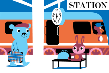
Which one of these two illustrations would be best as a poster?

I know this one looks better right now because it´s bigger but imagine the station really big aswell.

Which one of these two illustrations would be best as a poster?

I know this one looks better right now because it´s bigger but imagine the station really big aswell.
5 Comments
Number 2. Regardless of the size difference. The composition is awesome and the simple background makes it easy to place. It is also full of joy and movement, while the other one is more everyday, slow tempo. I like the station one as well but as a poster I have to say the one with the balloons!
Another thing that strikes me is: what happens if you mirror the balloon picture so that you get a positive diagonal in the picture, and the ballons strive ”forwards” in the direction which we read, instead of backwards. Am not sure that this is a great change, but maybe worth looking at.
Jag röstar också på Tivoli.
Att spegelvända bilden, som föreslås av Rebecca, tycker jag är ett klokt förslag.
jag tycker båda skulle bli jättefina posters men om jag skulle välja en att sätta i min dotters rum tex. så skulle jag nog välja den med tåget, det finns ju så mycket roliga detaljer i den bilden att titta och peka på! 🙂
Om man måste välja så väljer jag stationen.